Streetball2k3's Signature/Avatar Gallery

Discussion in 'Old Graphics' started by Streetball2k5, Aug 31, 2004.

  1. Streetball2k5

    Streetball2k5 JBB JustBBall Member

    Joined:
    Dec 1, 2003
    Messages:
    842
    Likes Received:
    0
    Trophy Points:
    16
    Don't laugh, these are the first 3 things I've made on photoshop. Tips and pointers are always welcome.

    [​IMG]

    [​IMG]

    [​IMG]
     
  2. Midnight Green

    Midnight Green NFLC nflcentral.net Member

    Joined:
    Jun 11, 2004
    Messages:
    7,487
    Likes Received:
    0
    Trophy Points:
    36
    Those are very good for your first three your avatars are tight the sig is pretty good just needs better text and a high quality image.
     
  3. Karma

    Karma The Will Must Be Stronger Than The Skill

    Joined:
    Nov 20, 2003
    Messages:
    2,221
    Likes Received:
    1
    Trophy Points:
    38
    The sigs aren't bad. The Baron one is actually really good for your first time. The Carter one is pretty plain as well the quality is low on the picture. A higher quality picture as well as better font use would make that one better (the Baron Davis fonts were nice).

    I think if you practice you can really be one of the better artists on this board since your first sigs were pretty nice, with practice you can only excel even more. Keep it up.
     
  4. P.A.P.

    P.A.P. JBB Fresh Start

    Joined:
    Jul 1, 2004
    Messages:
    4,739
    Likes Received:
    0
    Trophy Points:
    36
    Very nice for a first timer...I like your Celts avy.
     
  5. Rim-Rocca

    Rim-Rocca JBB JustBBall Member

    Joined:
    Apr 22, 2004
    Messages:
    900
    Likes Received:
    0
    Trophy Points:
    16
    ya, i think its pretty good for 1st timer, your avatars are nice.
     
  6. Sex Panther

    Sex Panther works every time.

    Joined:
    Aug 19, 2004
    Messages:
    5,528
    Likes Received:
    93
    Trophy Points:
    48
    Occupation:
    Ask.
    Location:
    Toronto, ON
    Not bad, remember, practice makes perfect [​IMG]

    <u>for all three:</u>
    -you need to get better quality images
    -it seems like all three backgrounds are the same but are different colors, you need to try out all the filters and diesgin a variety of backgrounds by yourself to improve
    - get better text/fonts
     
  7. N4S

    N4S BBW Member

    Joined:
    May 17, 2004
    Messages:
    2,732
    Likes Received:
    0
    Trophy Points:
    36
    <div class="quote_poster">Quoting spawn:</div><div class="quote_post">The sigs aren't bad. The Baron one is actually really good for your first time. </div>

    [​IMG]

    It's by Infante not him. But I really like the avy's good job.
     
  8. Streetball2k5

    Streetball2k5 JBB JustBBall Member

    Joined:
    Dec 1, 2003
    Messages:
    842
    Likes Received:
    0
    Trophy Points:
    16
    Thanks guys, I'll keep trying! And Yes, Need4Sheed is correct, the Baron Davis signature is not mine, it is curtiousy of Infante, who is easily my favourite designer.
     
  9. Glen Infante

    Glen Infante JBB Trend Setter

    Joined:
    Dec 24, 2003
    Messages:
    1,985
    Likes Received:
    0
    Trophy Points:
    36
    Phat avatars homie. I can already sense an early breakout.
     
  10. JJA

    JJA JBB JustBBall Member

    Joined:
    Jun 20, 2004
    Messages:
    253
    Likes Received:
    0
    Trophy Points:
    16
    Avatar #1- Not bad, the Bg 'style' the chrome kinda effect ive seen tons of times.. almot too many.. BUt, overall good.

    Avatar#2- The logo is too hard to see/read. The colors match well though.

    Sig #1- Vince's head has a chunk taken out of it. It looks kinda empty, maybe next tiem add another pic blended in or lower opacity. The text doesn't look that great, that huge stroke looks bad.

    Overall- You are pretty good for a beginner, Im with Infante on this one, with a bit more practice etc. you could become real good. Nice work so far!
     
  11. Streetball2k5

    Streetball2k5 JBB JustBBall Member

    Joined:
    Dec 1, 2003
    Messages:
    842
    Likes Received:
    0
    Trophy Points:
    16
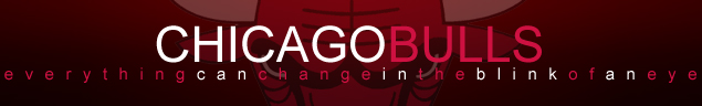
    Thanks JJA, I will take that into consideration.

    I was just fiddling around with backgrounds and I made this cool, eye type thing.

    I call it, The EYE. lol

    [​IMG]
     
  12. JJA

    JJA JBB JustBBall Member

    Joined:
    Jun 20, 2004
    Messages:
    253
    Likes Received:
    0
    Trophy Points:
    16
    Lol. Radial Blur? If it were to be used in a sig... probably a little bit plain. Depends what you do with it though.
     
  13. Streetball2k5

    Streetball2k5 JBB JustBBall Member

    Joined:
    Dec 1, 2003
    Messages:
    842
    Likes Received:
    0
    Trophy Points:
    16
    Yeah, I'm pretty sure I was radial blurring everything lol.

    P.S JJA I'm adding you on AIM, let's talk.
     
  14. JJA

    JJA JBB JustBBall Member

    Joined:
    Jun 20, 2004
    Messages:
    253
    Likes Received:
    0
    Trophy Points:
    16
    K.


    I can see some potential. Have you worked weith brushes?
     
  15. Streetball2k5

    Streetball2k5 JBB JustBBall Member

    Joined:
    Dec 1, 2003
    Messages:
    842
    Likes Received:
    0
    Trophy Points:
    16
    The Matrix:

    [​IMG]

    Comments?
     
  16. Streetball2k5

    Streetball2k5 JBB JustBBall Member

    Joined:
    Dec 1, 2003
    Messages:
    842
    Likes Received:
    0
    Trophy Points:
    16
    Newest creation... Comments?

    [​IMG]
     
  17. JJA

    JJA JBB JustBBall Member

    Joined:
    Jun 20, 2004
    Messages:
    253
    Likes Received:
    0
    Trophy Points:
    16
    The MAtrix- Needs better text
    Carmelo- Needs better text

    Overall, work on your font selection, and your cut-outs. And, on the matrix one there is plenty of empty space to fill up [​IMG]
     

Share This Page